HTML/CSS
HTML Fundamentals
Editor: VScode
Plugin: Image Preview, Color Highlight, Auto Rename Tag,
See the Pen by Le Duy (@iamthankyou) on CodePen.
CSS Fundamentals
Pseudo class
Điều khiển đến các thẻ con.
Absolute Position
Pseudo Element
See the Pen CSS by Le Duy (@iamthankyou) on CodePen.
Layouts: Floats, Flexbox, And CSS grid fundamentals
Floats
Khi sử dụng float 2 phần tử: 1 left, 1 right có thể bị vỡ bố cục, như thẻ h1 và nav như dưới, lí do là vì float làm mất chiều cao (không quan tâm tới chiều cao), vì vậy, sau khi float cần clear float, có thể dùng 1 thẻ div để clear, nhưng thế làm dối HTML, nên ta dùng 1 thẻ ẩn .clear, gọi đến 1 pseudo-element con là after (nó cũng như 1 thẻ div rỗng) rồi clear:
Search google hack clearfix
Khi sử dụng float, ví dụ article float left, aside float right, nhưng vì dưới aside là footer nên bố cục sẽ là article bên trái, aside bên phải và fotter dưới aside bên phải (do footor bị ảnh hưởng bởi aside), để khắc phục điều này ở thẻ footer cần clear: both (gần như ví dụ trên).
Box-sizing
Để quản lý các phần tử tốt hơn, thay vì tìm chiều rộng chiều cao cho 1 thẻ quá khó, ta thêm box-sizing, nó sẽ gộp tất cả các tham số thành 1 thể (tiện lợi khi thao tác với nhiều component khác nhau).
Flexbox
Flex giúp code dễ dàng hơn trong việc chia layout.
CSS Grid
See the Pen Layout by Le Duy (@iamthankyou) on CodePen.
Web Design Rule & Framework
Nhằm giữ nguyên ý nghĩa của rule, mình sẽ không dịch.
Typography
- 01. Use only good and popular typefaces and play it safe
- 02. It’s okay to use just one typeface per page! If you want more, limit to 2 typefaces
- 03. Choose the right typeface according to your website personality
- 04. When choosing font-sizes, limit choices! Use a “type scale” tool or other pre-defined range
- 05. Use a font size between 16px and 32px for “normal” text
- 06. For long text (like a blog post), try a size of 20px or even bigger
- 07. For headlines, you can go really big (50px+) and bold (600+), depending on personality
- 08. For any text, don’t use a font weight under 400 (regular)
- 09. Use less than 75 characters per line
- 10. For normal-sized text, use a line height between 1.5 and 2. For big text, go below 1.5
- 11. Decrease letter spacing in headlines, if it looks unnatural (this will come from experience)
- 12. Experiment with all caps for short titles. Make them small and bold and increase letter-spacing
- 13. Usually, don’t justify text
- 14. Don’t center long text blocks. Small blocks are fine
Colors
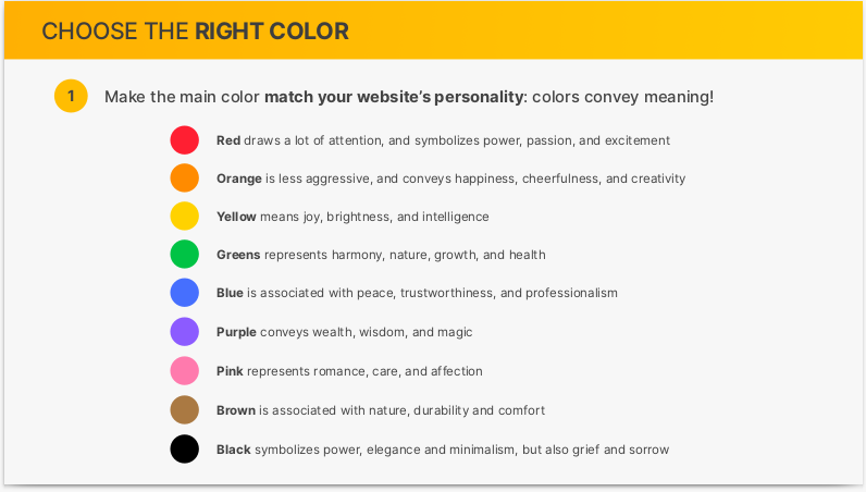
- 01. Make the main color match your website’s personality: colors convey meaning!
- 02. Use a good color tone! Don’t choose a random tone or CSS named colors.
- 03. You need at least two types of colors in your color palette: a main color and a grey color
- 04. With more experience, you can add more colors: accent (secondary) colors (use a tool)
- 05. For diversity, create lighter and darker “versions” (tints and shades)
- 06. Use your main color to draw attention to the most important elements on the page
- 07. Use colors to add interesting accents or make entire components or sections stand out
- 08. You can try to use your color strategically in images and illustrations
- 09. On dark colored backgrounds, try to use a tint of the background (“lighter version”) for text
- 10. Text should usually not be completely black. Lighten if up it looks heavy and uninviting
- 11. Don’t make text too light! Use a tool to check contrast between text and background colors
Image and Illustrations
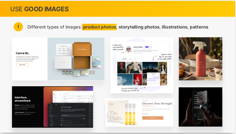
- 01. Different types of images: product photos, storytelling photos, illustrations, patterns
- 02. Use images to support your website’s message and story. So only use relevant images!
- 03. Prefer original images. If not possible, use original-looking stock images (not generic ones!)
- 04. Try to show real people to trigger user’s emotions
- 05. If necessary, crop images to fit your message
- 06. Experiment combining photos, illustrations and patterns
- 07. Method #1: Darker or brighten image (completely or partially, using a gradient)
- 08. Method #2: Position text into neutral image area
- 09. Method #3: Put text in a box
- 10. To account for high-res screens, make image dimensions 2x as big as their displayed size
- 11. Compress images for a lower file size and better performance
- 12. When using multiple images side-by-side, make sure they have the exact same dimensions
Icons
- 01. Use a good icon pack, there are tons of free and paid icons packs
- 02. Use only one icon pack. Don’t mix icons from different icon packs
- 03. Use SVG icons or icon fonts. Don’t use bitmap image formats (.jpg and .png)!
- 04. Adjust to website personality! Roundness, weight and filled/outlined depend on typography
- 05. Use icons to provide visual assistance to text
- 06. Use icons for product feature blocks
- 07. Use icons associated with actions, and label them (unless no space or icon is 100% clear)
- 08. Use icons as bullet points
- 09. To keep icons neutral, use same color as text. To draw more attention, use different color
- 10. Don’t confuse your users: icons need to make sense and fit the text or action!
- 11. Don't make icons larger than what they were designed for. If needed, enclose them in a shape
Shadows
- 01. You don’t have to use shadows! Only use them if it makes sense for the website personality
- 02. Use shadows in small doses: don’t add shadows to every element!
- 03. Go light on shadows, don’t make them too dark!
- 04. Use small shadows for smaller elements that should stand out (to draw attention)
- 05. Use medium-sized shadows for larger areas that should stand out a bit more
- 06. Use large shadows for elements that should really float above the interface
- 07. Experiment with changing shadows on mouse interaction (click and hover)
- 08. Bonus: Experiment with glows (colored shadows)
Border Radius
- 01. Use border-radius to increase the playfulness and fun of the design, to make it less serious
- 02. Typefaces have a certain roundness: make sure that border-radius matches that roundness!
- 03. Use border-radius on buttons, images, around icons, standout sections and other elements
White Space
- 01. Use tons of whitespace between sections
- 02. Use a lot of whitespace between groups of elements
- 03. Use whitespace between elements
- 04. Inside groups of elements, try to use whitespace instead of lines
- 05. The more some elements (or groups of elements) belong together, the closer they should be!
- 06. Start with a lot of whitespace, maybe even too much! Then remove whitespace from there
- 07. Match other design choices. If you have big text or big icons, you need more whitespace
- 08. Try a hard rule, such as using multiples of 16px for all spacing
Visual Hierarchy
- 01. Position important elements closer to the top the page, where they get more attention
- 02. Use images mindfully, as they draw a lot of attention (larger images get more attention)
- 03. Whitespace creates separation, so use whitespace strategically to emphasize elements
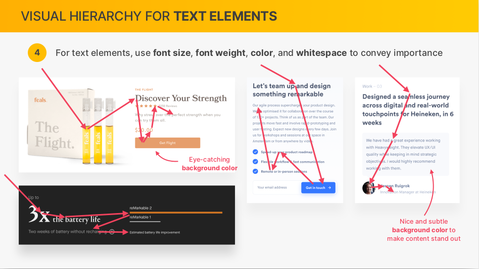
- 04. For text elements, use font size, font weight, color, and whitespace to convey importance
- 05. What text elements to emphasize? Titles, sub-titles, links, buttons, data points, icons
- 06. Emphasize an important component using background color, shadow, or border (or multiple)
- 07. Try emphasizing some component A over component B by de- emphasizing component B
- 08. What components to emphasize? Testimonials, call-to-action sections, highlight sections, preview cards, forms, pricing tables, important rows/columns in tables, etc.
User Experience (UX)
- 01. Don’t design complicated layouts. Don’t reinvent the wheel. Use patterns that users know
- 02. Make your call-to-action the most prominent element, and make the text descriptive
- 03. Use blue text and underlined text only for links!
- 04. Animations should have a purpose and be fast: between 200 and 500 milliseconds
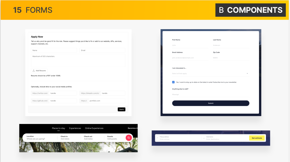
- 05. In forms, align labels and fields in a single vertical line, to make the form easier to scan
- 06. Offer users good feedback for all actions: form errors, form success, etc. [web apps]
- 07. Place action buttons where they will create an effect (law of locality) [web apps]
- 08. Use a descriptive, keyword-focused headline on your main page. Don’t be vague or fancy!
- 09. Only include relevant information, efficiently! Cut out fluff and make the content 100% clear
- 10. Use simple words! Avoid technical jargon and “smart-sounding” words
- 11. Break up long text with sub-headings, images, block quotes, bullet points, etc.
Elements and Components
- 01. Use common elements and components to convey your website’s information
- 02. Combine components into layouts using common layout patterns
- 03. Assemble different layout areas into a complete, final page
See the Pen by Le Duy (@iamthankyou) on CodePen.
References
Components and Layout pattern
Accordtion
See the Pen Accordion by Le Duy (@iamthankyou) on CodePen.
Carousel
See the Pen Carousel by Le Duy (@iamthankyou) on CodePen.
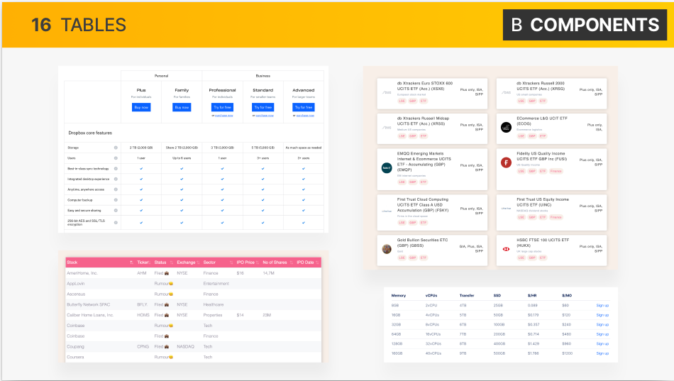
Table
See the Pen Table by Le Duy (@iamthankyou) on CodePen.
Pagination
See the Pen Pagination by Le Duy (@iamthankyou) on CodePen.
Layout Patterns
Hero
See the Pen Hero by Le Duy (@iamthankyou) on CodePen.
Layout
See the Pen Layout_App by Le Duy (@iamthankyou) on CodePen.
Project
Vui lòng xem code tại github.
Responsive
Hiểu về @media cho responsive
Breakpoints
Breakpoints là điểm phân chia bằng thẻ @media, là cách tốt nhất để phân chia màn hình hiển thị cho các thiết bị.
Thêm thẻ meta vào file index để tránh hiện tượng trang web tự động fit với màn hình, vì responsive mỗi màn hình sẽ hiển thị khá nhau.
Để font-size được ổn định khi dùng Rem, hãy đặt kích cỡ màn hình của thẻ @media theo em: công thức: (tỉ lệ width /16) em
Effects, Optimizations
Code javascript smoothing neo:











Nhận xét
Đăng nhận xét